
Responsive vs. Adaptive Website Design – Which Is Better?
The world of website design has changed enormously over the years, starting with boring black and white walls of text and morphing to modern-day websites with color and visually appealing graphics. While initially websites were designed solely for viewing on large desktop screens, in today’s world, mobile-friendly, interactive and graphically enhanced websites are the basic demand.
In this article, we will be discussing two of the major types of website design, complete from their features to the pros and cons, best practices and how to choose which design is the best suited to your needs!
Why Is Optimal Web Design So Important?
In today’s digital age, most business owners are already aware that a functioning website is essential in generating business for their brand- after all, your online presence can quite literally make or break your business. But is it enough to simply have a website of your own? Or is there more to the equation?
Simply put, having a working website alone is not enough. Your business’s website design plays a key role in generating leads and has a massive impact on user experience. Studies show that about 75% of web users make judgments about a business’s standards and credibility based on first impressions from its website alone! Whether consciously or not, each of us engages more with bright, clear graphics and interactive design than with a dull wall of text- and this makes it vital for every business to not only have an online presence but to make sure their website is sleek, modern and professionally designed.
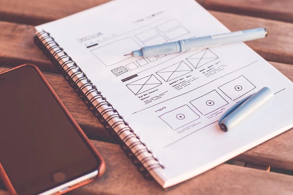
At A Glance
Now that we have established that good web design is important, let’s turn our attention to the million-dollar question- what exactly makes a good web design?
The most basic answer is that there is no one right way to design a ‘good’ website. But in order to explore the different features that make a website appealing, we must first understand the two major types of web design that are popular today.
-
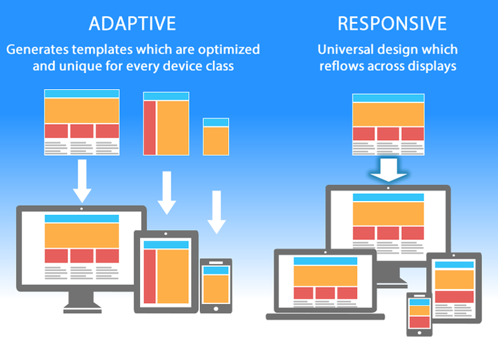
Responsive Web Design
In a nutshell, responsive website design is fluid, meaning it can mold itself to the size of the screen, no matter what viewing device is being used. Being more ‘mobile-friendly’, it focuses on showing the content neatly within the available space, and this form of web design is generally awarded well by Google.
-
Adaptive Web Design
Unlike responsive web design, adaptive design is not flexible, meaning that it does not automatically alter itself to best fit the viewing device. Instead, it makes use of multiple fixed designs that appear on corresponding display screens. Generally, web designers following this pattern create 6 different screen widths, based on the most common viewing devices, from desktops to mobile screens and beyond.
Both web design patterns are discussed in more detail below.
Responsive Vs. Adaptive Design-The Designer’s Quandary
There is no black and white answer when it comes to which design is superior to the other, and designers and experts in the field also have varying opinions. Some believe that the outcome is more important than the system or process employed- as long as the final website is interactive, appealing and converts visitors into long-term customers, it’s a job well done. Others put more emphasis on choosing the right type of design to yield the best possible results. In the end, it boils down to what the purpose and requirements for the website are.
RESPONSIVE WEB DESIGN
Responsive web design is generally the more popular one, as search engines such as Google rank these websites higher for being more mobile-friendly. Responsive websites also tend to yield better results and profits since they provide a more user-friendly experience that encourages visitors on the site to trust the brand. However, this design can be hard to implement on older websites that already have a strong domain. Designers might be frustrated trying to upscale the current website and might even have to start anew.
-
PROS
Responsive design has many advantages, some of which are discussed below.
- As touched upon earlier, these websites are better for SEO rankings as they are promoted by most search engines for being user-friendly. Generally, a well-structured responsive website is less likely to end up at the bottom of the search result pile.
- They are easier to design and take less time, as they require lesser code writing and layout control. They are thus preferred by designers and business owners looking to get the work done on a more urgent basis.
- As they are adaptable to all devices, they maintain consistency and provide a better user interface, encouraging more visitors to the site.
- These websites use a single URL to accommodate any screen size. To understand this better, you can picture a liquid taking the shape of the container it’s being poured in- the web content expands and shapeshifts to fit the screen it’s being displayed on.
- Responsive web design is significantly more budget-friendly. As it does not involve multiple templates, the cost of development, support and maintenance are greatly cut down.
- These websites require less maintenance than adaptive ones. This is because all content is organized in a singular location, and displays the same page on every device.
-
CONS
Although this type of web design is recommended by many, it does not come without certain downsides.
- These sites generally take longer to load, as they hold information for all devices and not just the screen you are using to view the site. Slower response times can contribute to user dissatisfaction, causing them to log off without exploring the site.
- Responsive sites are not the most ideal for integrating advertisements. As they have to cater to all resolutions and devices, the ads might get disfigured when transitioning from one viewing screen to another.
- As they are fluid, the elements of a responsive design are shifting to fit the screen. This can sometimes result in distortions in text, graphics and images, which take away from the outlook and professional appeal of the website and might discourage users from revisiting.
The Importance Of Responsive Design
Although this type of website designing is by no means flawless, it’s easy to understand why it holds high regard amongst professionals in this field. Think about it- if every designer had to develop a separate version of every website for every device on the market, the cost and time of production would be too overwhelming. Responsive design provides an alternative pathway to this method, and also makes it easier to incorporate technology changes and upgrades with time.
Responsive web design also holds great importance because of the sheer number of users that log onto websites from their smartphones. In the first quarter of 2021, mobile devices made up over 54% of all web user traffic- so it’s clear that the vitality of responsive design in this regard cannot be questioned.
ADAPTIVE WEB DESIGN
While adaptive web design is less popular than responsive, it is the preferred method in certain scenarios. Many designers make use of adaptive design to upscale an already existing website and make it more user-friendly. This form of design allows the designer to generate multiple view-ports, meaning that the designer and company can choose how many devices they wish to cater to, depending on their business size, budget, and requirements. In this way, adaptive web design offers greater control over layout, cost and outcome as compa
red to responsive design.
Generally, designers prefer to build for six resolutions, starting from the lowest and working their way up. This also comes in handy when launching existing websites, allowing the designer the freedom of upgrading easily without needing to start anew.
-
PROS
- Adaptive websites have faster loading speeds, as the display is pre-made to fit the selected screen and does not need to mold itself to the device. This is beneficial in providing visitors with quick search results, making it more likely for them to revisit the site.
- This design offers greater control over each layout. For example, if the business wishes certain features to be available on desktop but not on mobile, the designer can take these requirements into consideration, as each viewport is built separately. It’s easy to add or remove content or features, which cannot be done in responsive design.
- Adaptive design opens up more opportunities for studying user traffic and implementing changes to encourage growth. For example, if a website receives most of its visitors through smartphones, the designer can upgrade the load time, aesthetics and media to elevate the mobile user experience, leading to higher user satisfaction. This also allows both the business and the designers to put their time and money where it is needed most and holds the most potential for returns.
- Unlike responsive design, adaptive design is highly optimized for adverts, no matter how large or small the viewing screen.
-
CONS
- Requires longer design times and is more labor intensive on the designer’s part, as multiple versions of the same website need to be created.
- Adaptive design requires more maintenance since each version will have to be updated if the business is trying to transform its online presence. If there are six resolutions, the changes will need to be separately implemented on all six, increasing workload and cost of maintenance.
- They are also generally more expensive to design, as they require a greater team of technicians. And with updates, error-correcting and maintenance, there will be more costs to address even after the website is complete.
- Adaptive design generally has lower search engine rankings, meaning your website can get lost amongst a flurry of others.
The Best Practices To Implement As A Website Designer
No matter which website design type you choose as a developer, there are always some practices that can be followed to ensure that the final product is up to the mark and meets the client’s requirements.
-
Put Yourself In The User’s Shoes
It isn’t simply enough to create a website, include relevant information and call it a day. There are a great many complexities to web designing which can largely affect the final product and the kind of response the website receives.
As a designer, it is essential to view your work through the user’s eyes. Is the text easy to read? Is the information divided into relevant sections and properly labelled? Are there interesting graphics and interactive images that will make the user keep on scrolling? Have you included contact details and other necessary information they might look for? Is there space for user engagement?
Trying to accommodate each of these demands and more is essential if you wish to provide an elevated user experience.
-
Mobile Friendliness
With over 50% of the population visiting the website through their phones, mobile-friendliness can single-handedly determine the website’s performance. It is extremely important as a designer to make sure you are catering to every intricacy that comes with mobile usage, as even the smallest frustrations can send mobile users running in another direction. For example;
- Keep the interactive elements (backlinks, buttons) at the center of the screen, since it is easier to reach than the corners when using thumbs.
- Main navigation buttons should be at the bottom of the screen so that they’re more visible and easy to select.
These are just some basic examples of how designers use acute attention to detail and implement small features that make a website more accommodating to mobile users. Though they are minor elements, they make a huge difference.
-
Less Is More
Although a good website should have relevant help boxes, FAQ sections, contact details and other important information clearly displayed, be sure to not go overboard and shove all details on one page. Not only is a wall of text overwhelming to read, but important information may get lost in between the lines. As a designer, it is important to communicate with your client on what their top priority through their website is and make sure that section or information is more highlighted through your design.
Try and give the website a clean-cut, sleek and modern outlook, but use interesting graphics and color to give it some life- it can be simple without being boring!
-
Consistency
When trying to adapt your site to major platforms, it’s important to ensure that you don’t give up on quality for quantity. It’s extremely essential that your website gives a consistent performance on all devices, instead of working marvelously on one while crashing on the other. An inconsistent browsing experience will lead to user frustration, causing you to lose potential customers. Also, make sure that relevant information is prominently displayed on all platforms, and that other important navigating tools are easy to find on every device.
Choosing What’s Right For You
If you’re still confused about what design will be well suited for your business, here are some guidelines to help you decide.
-
When To Use Adaptive
Adaptive web design will be ideal for you if:
- You already have an advanced website with a strong user base and are looking to simply update it and make it more mobile-friendly.
- You wish to have more control over your website layout, content, and delivery, plus how it appears across multiple platforms.
- You have a greatly targeted audience- that is you wish to adapt your website to your users’ location, demands, internet connection speed, and more.
- Having speedy search results is of great importance to your business.
- You would like to cater to shifting user intents. For example, your users display a different visitor behavior on desktop and mobile and you wish to respond accordingly.
- You have a retail business or eCommerce website, where your major intent is to provide a list of browsing options and include purchasing methods.
- You wish your website to be advertisement friendly.
-
When To Use Responsive
Responsive web design is the way to go if:
- Your website is content heavy.
- You wish to display several pages and would like visitors to interact with them all.
- You are working on a budget and within time constraints.
- You are a small-scale to medium-size company looking to update an existing website.
- You work in the service industry, as most of your content is likely to be text and images.
- You need to build and launch a website from scratch.
As we have established in this article, both forms of web design come with unique advantages and disadvantages, with neither one being the perfect model to follow. The question isn’t whether adaptive or responsive is better- but simply which one applies best to your scenario.
At the end of the day, it is up to the designer and the business to collaborate and determine what their top priorities are, and which type of web design
will best bring out their business model. You should consider who your audience is, what device they use to connect with you, and what sort of experience you wish to provide through your site before you decide on a design to implement.